Nature of the Project
From the get go it was made clear that the brand new platform would not be putting itself in competition with organizations in the same industry. It would also not run the risk of becoming “just another” platform.
Instead the objective was to build a light-weight platform, with enough content to keep most of its intended audience happy. There would be no false promises, no pretenses, just an honest representation of the company.
These efforts ironically began through close studies of competitor sights. A general list of strengths and weaknesses was made. It was noted that larger companies could afford a web presence designed by an expensive design firm. Smaller operators made use of pre-fabricated solutions such as bootstraps and WordPress – in many cases those put together by a less experienced design firm.
Design Process
Having absorbed some of the ideas and reflected over various kinds of layouts, we began drawing mockups. Mockups are an excellent means of simulating the look of the project to a certain degree.
The limitations that exist may be made up for by more expensive software that could not be made feasible for this project.
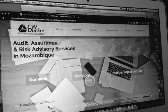
Initial mockups of home page yielded consensus. A simple page with three main options would allow a user to read about our work, check out our history or jump right in and start working with us.
The solution was vastly different from competitor sites which often advertise their own work and on which any user can spend literal hours browsing. This process was then replicated for each new page.
Content that had already been given, was inspected thoroughly and notes made on what was appropriate, irrelevant, wordy or boring within the context of the design. The company was then asked to redo the content with our advice on copywriting.
In this project, special attention was given to making the navigation easy and relevant. There are three levels: global, secondary and contextual. Similarly labels have been designed to be succinct and common to a degree with other sites.
No search tools were made available as it was decided the level of content held on the site could not justify it.
Asset Collection & Management
No effort on the web can run away from this. Some projects of course are easier than others. Finding ourselves short of serious art direction we turned to the next best thing: stock assets.
The web is chock-full of assets. Images, videos, vectors – all can be had for a price. But wanting to turn our project as economical as possible for our client we turned to assets that could be licensed under CC.
This aspect of the project took considerably longer and ways are being sought in which this can be shortened. One reason why AM takes long is because each asset has to be evaluated against itself and also as part of the other elements on the site for both quality and overall fit.
Once selections are made, it often has to be modified heavily in a variety of applications such as Photoshop, ImageOptim and others to help it meet UX requirements of modern websites. These requirements including optimization for low and high density (retina) displays.
Responsive Design
The number of users accessing the web from mobile devices is growing in the client’s home market which is considered a developing economy. A responsive design ensures the reach of the site is as wide as possible. A mobile first approach was taken to allow:
- Display of graphics based on the quality of users’ screen
- Using media queries to adjust the layout
- SVG instead of raster graphics to ensure low data charges
- Reduce load times
Notable in this project was the use of responsive image techniques. The use of the srcset property of the CSS has allowed the site to be optimized for high and low density pixel devices – among other names the “Retina” devices. Additionally the w-descriptors allow for art-directed images to be loaded at determined breakpoints.
Information Organization & Labeling
The layout of the site has been optimized for clarity and ease of use. There are a few content rich pages which provide in-depth information about the company and then a second group which provides localized content.
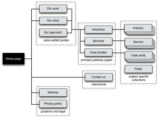
A high-level information architecture blueprint for the site
Given the nature of the content that will be included on the site, there is very little opportunity for the implementation of exact organization schemes, these are for example organizing collections of information according to date or the alphabet.
There is however the use of the ambiguous organization scheme through topic, task and audience.
Referring to the blueprint, users can read about the organization’s background, its staff and the kind of work it has experience in. Alternatively, they can access localized information about industries, services provided and related case studies.
Navigation Systems
The navigation system for the site was reviewed and revised several times over and now consists of global and contextual elements. Local elements do not figure into the design as there is no content to justify its existence.
The global navigation is provides quick access to the most important areas of the site. It is available on every page with the following links:
Home – return to the home page
Industries – localized content for every industryServices – principal page of services provided by the organization
Our Approach – one of the pages from the value-added guides
FAQs – all the frequently asked questions about the local market
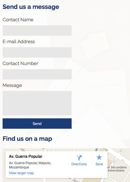
Contact Us – contact details, including embedded Google Maps
Contextual navigation present on the site helps the user to navigate through the site as though a story is being read. When the user follows these links which have been made purposely large, they will run through the key areas of the site.
This strategy ensures that users are less likely to get lost and therefore less likely to waste time on the richer content.
Interactivity
While some competitor organizations enable a much higher level of interactivity through the use of forms and document uploads, this project did not include those features for reasons of economy. A minimum level of interactivity is still guaranteed through the use of a contact form which enabled by PHP scripts allow the user’s message to be sent directly via e-mail to the company director. An integrated Google Map allows the location to be saved by the users for later reference or as navigational aid to the physical premises.